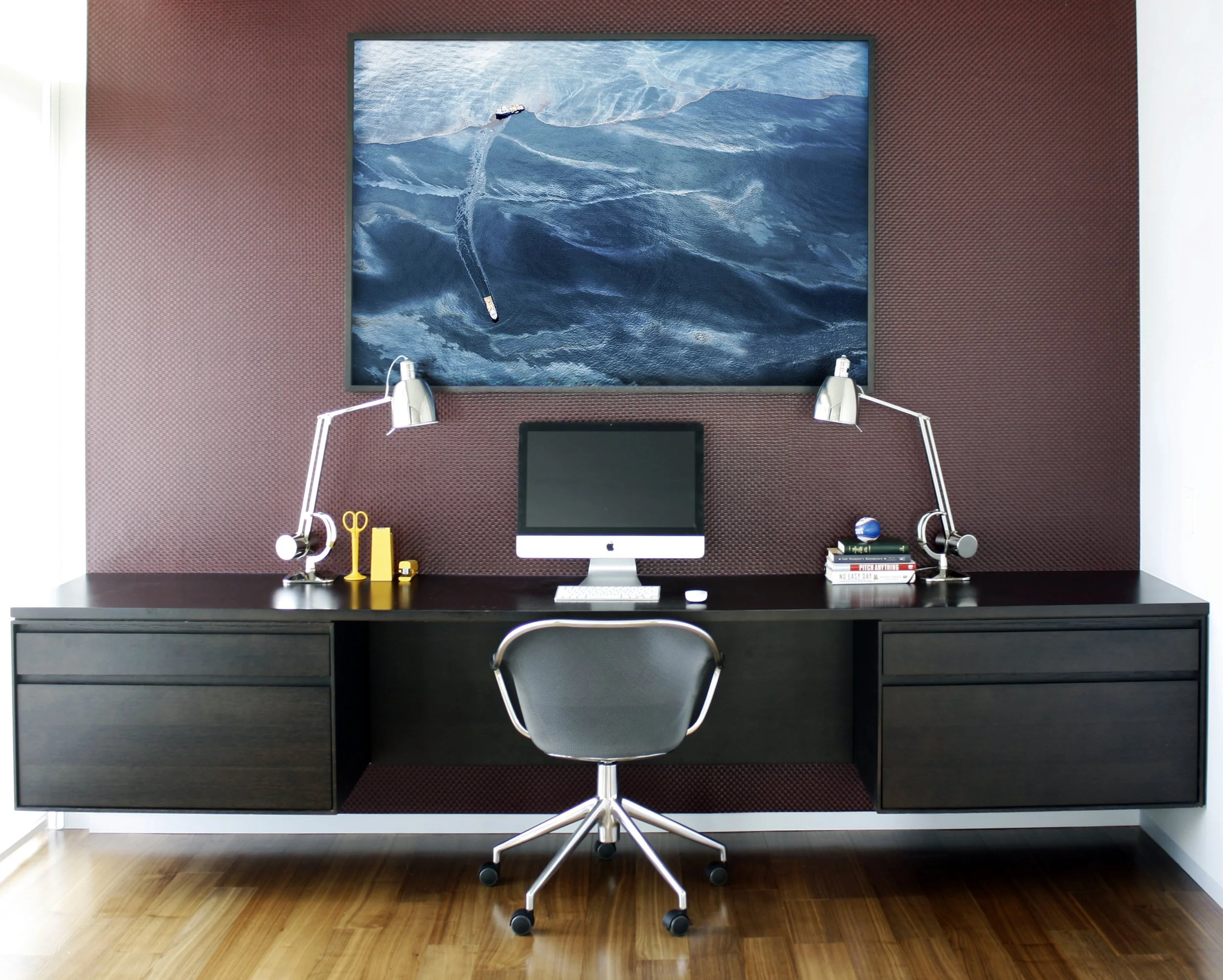
PEARSON RESIDENCE
Although in a new, well-located building, this apartment started life marked by a jumbled layout and a set of finishes and details lacking character and finesse. The new homeowner craved a distinctive, refined, and welcoming place to hang his hat and comfortably entertain. The basic configuration of the apartment has been kept with the exception of a handful of critical architectural moves. A telescoping series of sleek sliding doors replaces a solid wall that isolated the study from the main living space. An added ceiling plane and large island expand the original cramped kitchen into an awkwardly over-scaled dining zone. Shifting the walls of the master hall to align it with the main hall creates a continuous line of sight which in turn visually expands the entire apartment and brings light into its darkest reaches. A series of quarter-sawn and plain-sliced American Black Walnut panels wrap the master suite and distinguish the main entry. The walnut extends into the living room as media storage before terminating in the kitchen where it sleekly conceals a wall of hidden appliances. The boldness of the walnut is balanced by a minimalist reworking of the trim, cabinetry, and lighting throughout the apartment. A carefully considered collection of relaxed yet refined furniture complements the architecture.


